Best Home Office Paint Colors for Focus
The best home office paint colors are the ones that keep the room comfortable to look at for eight hours: soft blue-greens, muted greens and warm, light neutrals. Bold colors can work too, but in a room where you stare at a screen all day, glare, gloom and visual noise matter more than any trend.
This guide names specific Sherwin-Williams and Benjamin Moore colors for focus, calm, video calls and small rooms, with each one's light reflectance value (LRV) from the brand's own data. It also explains how your window direction changes a color, and what research on color and productivity actually shows (it's less than most articles claim). It's the same thinking the Lifetime Custom Painting team uses when San Diego homeowners turn a spare bedroom into a workspace.
Quick answer: The best home office paint colors for focus are soft, slightly muted blue-greens and greens (Sherwin-Williams Sea Salt, Rainwashed, Benjamin Moore Palladian Blue) and warm light neutrals (Accessible Beige, Pale Oak), ideally with an LRV between about 50 and 65. They keep the room bright without glare. Deep greens and navies (Pewter Green, Naval) work in well-lit offices you use mainly for reading or calls.
Key Takeaways
- Aim for an LRV of roughly 50–65 on office walls: light enough to brighten the room, soft enough to avoid screen glare.
- North-facing offices need warmer, higher-LRV colors; sunny south- and west-facing offices can take cooler or deeper ones.
- A 2009 lab study linked blue to creative tasks and red to detail tasks, but a later replication of one of its experiments failed.
- Muted blue-greens and warm neutrals are the safest all-day colors; save bold color for one wall or the trim.
- A mid-tone wall behind your desk camera makes video calls look better than stark white.
What Are the Best Home Office Paint Colors for Focus?
The best colors for a focused home office are calm, slightly grayed blues, greens and warm neutrals in the light-to-mid range. They are easy on the eyes over long hours and don't compete with what's on your screen.
Here's a shortlist by goal. LRVs come from each manufacturer's own color data.
| Goal | Color | Brand & code | LRV |
|---|---|---|---|
| Calm focus (blue-green) | Sea Salt | Sherwin-Williams SW 6204 | 63 |
| Calm focus (blue-green) | Rainwashed | Sherwin-Williams SW 6211 | 59 |
| Calm focus (blue-green) | Palladian Blue | Benjamin Moore HC-144 | 60 |
| Quiet blue | Upward | Sherwin-Williams SW 6239 | 57 |
| Warm neutral | Accessible Beige | Sherwin-Williams SW 7036 | 58 |
| Warm neutral | Pale Oak | Benjamin Moore OC-20 | 69 |
| Video-call backdrop | Downing Sand | Sherwin-Williams SW 2822 | 52 |
| Grounded mid-tone | Boothbay Gray | Benjamin Moore HC-165 | 43 |
| Earthy green | Evergreen Fog | Sherwin-Williams SW 9130 | 30 |
| Deep library green | Pewter Green | Sherwin-Williams SW 6208 | 12 |
| Deep library green | Narragansett Green | Benjamin Moore HC-157 | 9 |
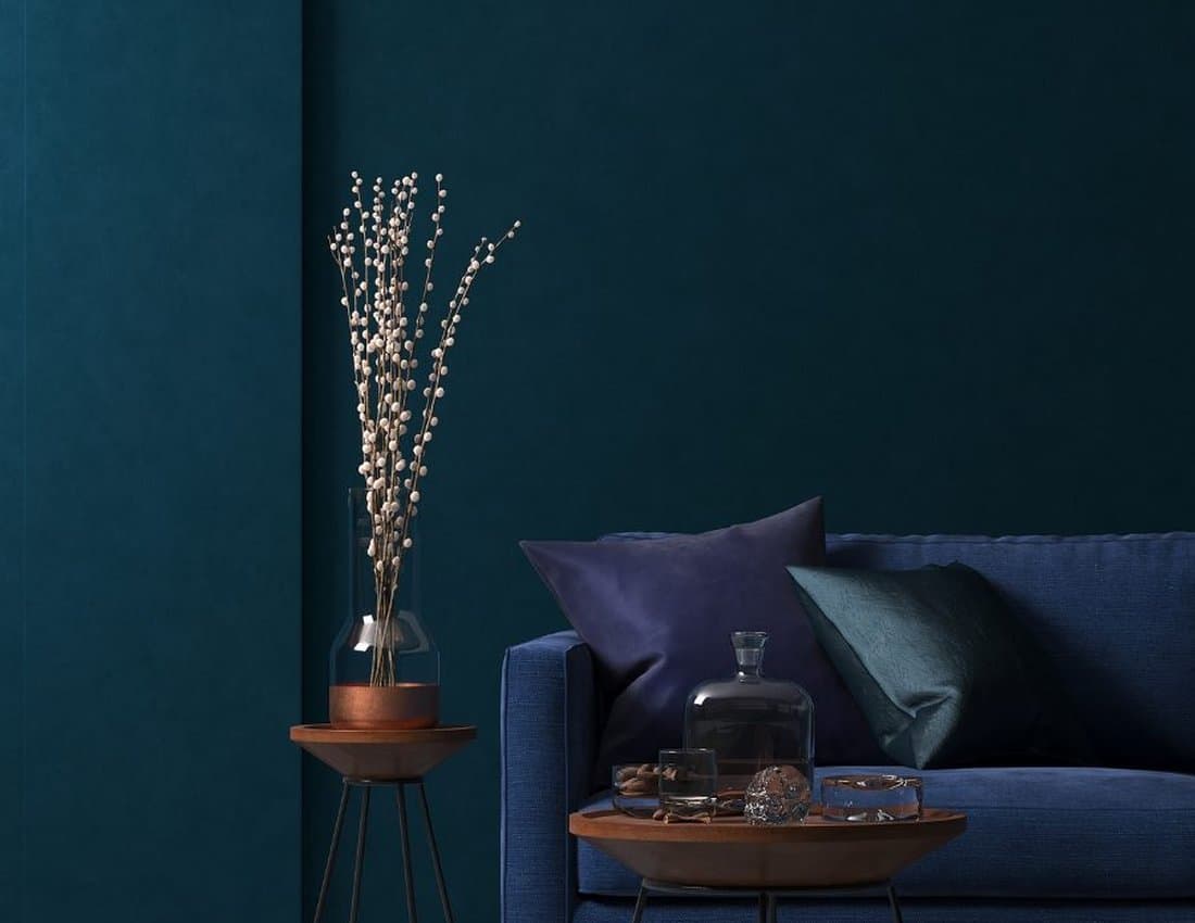
| Deep blue | Naval | Sherwin-Williams SW 6244 | 4 |
For most offices, start with the top half of the table. The deep colors at the bottom are beautiful in a study with good light, but they make a small or north-facing room feel dim by mid-afternoon. Sherwin-Williams pitches Naval as "perfect for your study or office", which holds true in a room with strong light.
What Does Research Say About Paint Colors and Productivity?
The honest answer is that color research is interesting but limited, and most "this color boosts productivity by X%" claims online have no traceable source. A few real studies are worth knowing.
- Blue versus red: a 2009 study in the journal Science by Mehta and Zhu found that red enhanced performance on detail-oriented tasks, while blue enhanced performance on creative tasks.
- But it didn't always replicate: a later paper in Psychonomic Bulletin & Review reported a failure to replicate part of that color effect.
- Green and creativity: a 2012 study in Personality and Social Psychology Bulletin by Lichtenfeld and colleagues found that a brief glimpse of green before a creativity task improved creative performance.
Notice what these studies tested: short exposures to color on a screen or card, in a lab, not the walls of a room you sit in for months. So treat them as a hint, not a rule. The rest of the advice in this guide, such as preferring muted blue-greens for all-day work, is designer and painter experience: those colors are restful to look at, they flatter wood and plants, and they rarely feel tiring.
How Does Light Direction Change Home Office Paint Colors?
The direction your office window faces changes a paint color more than almost anything else. Sherwin-Williams' guidance on choosing colors by room orientation sums it up well.
- North-facing: the least light all day. Sherwin-Williams advises avoiding cool undertones, which make the room look colder, and looking for higher-LRV colors. Pale Oak or Accessible Beige work well here.
- South-facing: consistent warm light. Avoid colors that are too warm, or the room can feel yellow. Sea Salt and Palladian Blue balance it nicely.
- East-facing: warm in the morning, cooler later. Great for early starters; a warm neutral keeps afternoons from feeling flat.
- West-facing: cool in the morning, warm and strong in the afternoon. Muted greens and blue-grays calm the late-day glare.
San Diego adds two local twists. Many offices get strong, clear sun, so colors read lighter and warmer than on the chip, and a west-facing office can be bright enough to handle a deeper green. Near the coast, overcast marine-layer mornings do the opposite, so a color that looks fresh at 3 p.m. may look gray at 9 a.m. Test samples at the hours you actually work.
What Are the Best Paint Colors for a Small Home Office?
For a small home office, choose a light, slightly warm or softly tinted color with an LRV around 60–70, and paint the trim and ceiling in a coordinating white. Light walls bounce more daylight around a compact room.
- Pale Oak (LRV 69) or Pure White (SW 7005, LRV 84) on the ceiling keeps a box room bright.
- Sea Salt or Rainwashed add a hint of color without closing in the walls.
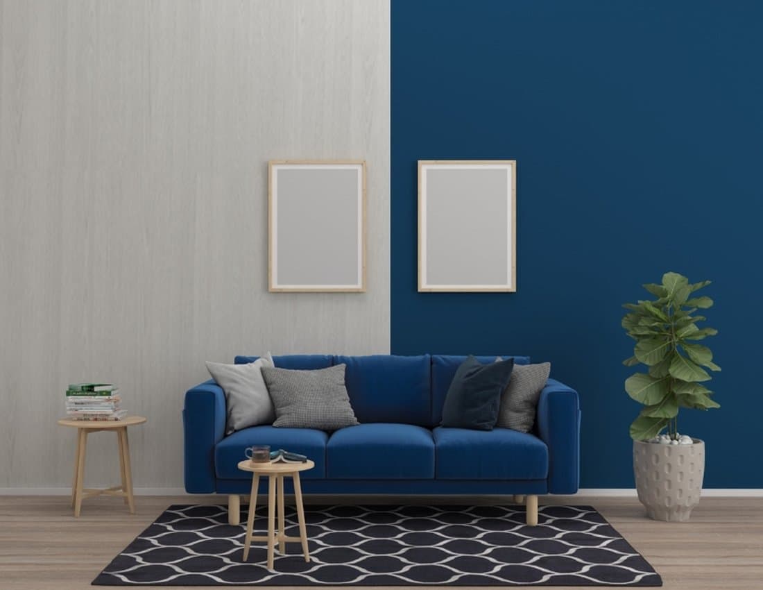
- Color-drench a tiny room on purpose: if your office is a converted closet or nook, painting walls, trim and even the ceiling in one mid-tone like Boothbay Gray can make it feel cozy and intentional rather than cramped.
- Avoid high-contrast trim: a stark white frame around every door and window makes a small room look busy.
Which Colors Look Best Behind You on Video Calls?
A soft, mid-tone wall behind your desk usually looks best on camera. A stark white wall behind you can make your face look darker on many webcams, while a very dark wall can make the picture look muddy.
Practical picks for the "camera wall":
- Downing Sand (LRV 52) or Accessible Beige (LRV 58): warm, flattering and neutral.
- Evergreen Fog (LRV 30): a muted green that adds depth without looking dark on screen.
- Boothbay Gray (LRV 43): a calm gray-blue that reads as polished and professional.
If you like a bold office, paint just the wall behind you and keep the other three light. That's also an easy way to try the warm, earthy colors trending this year; see our roundup of 2026 interior paint color trends for current shades.
What Paint Finish Should You Use in a Home Office?
Use eggshell or matte on home office walls. Lower sheens reduce glare from windows and lamps, which matters when you are looking at a screen, while eggshell is still easy to wipe clean around a desk.
Use satin or semi-gloss on trim and doors that get touched often. Our guide to choosing the right paint finish explains the differences in more detail. Lifetime Custom Painting, a licensed San Diego painting contractor (CSLB #1002304), uses premium low-VOC Sherwin-Williams and Benjamin Moore interior paints, which matters in a room you'll be working in soon after it's painted.
Frequently Asked Questions
What color is best for concentration in a home office?
Soft, muted blues and blue-greens are the most common choice for concentration because they are calm to look at over long periods. Lab research on color and focus is mixed, so choose a shade you find restful and that suits your light.
Is green or blue better for a home office?
Both work well. Blue-greens and muted blues suit sunny or west-facing rooms, while warmer greens and sage tones are often easier to live with in north-facing rooms that need more warmth.
Should a home office be painted white?
White can work, especially in a dark room, but bright, cool whites can cause glare and feel clinical over a full workday. A warm off-white or a light tinted color with an LRV around 60–70 is usually more comfortable.
What are the best home office paint colors for 2026?
The 2026 trend is warm and earthy, so warm neutrals, khakis and smoky blue-greens are popular for offices this year. They pair well with wood desks and shelving and look good on camera.
Are dark colors good for a home office?
Dark greens and navies can make a home office feel focused and cozy, but only with plenty of daylight or good lighting. In a small or north-facing room, use the dark color on one wall or on cabinetry instead.
Is yellow a good color for a home office?
A soft, muted yellow can feel warm and cheerful, but a bright yellow is tiring to look at for a full workday. If you love it, use it on one wall, a door or shelving, and keep the walls you face in a calmer neutral.
Try Two or Three Office Colors Before You Paint
The quickest way to find the best home office paint color for you is to put two or three large samples on the wall you face and the wall behind you, then check them at the hours you actually work.
If you'd like help choosing, Lifetime Custom Painting offers a free color consultation and a fixed, written quote for interior painting in San Diego. Request your free estimate or call (619) 591-9936.
Thinking about a project in San Diego?
Luis Rodriguez and the team give free, fixed written estimates — no pressure, no obligation.
- Licensed & insured
- 4.9★ · 291+ reviews
- 10% military discount